Top 13 Wall Collages of 2021
There’s nothing more rewarding as a photographer than serving a family from start to finish. Designing wall collages for my client’s is an important part of our time together. Every time I leave a family’s home after an installation I do a happy-dance knowing that they’ll be able to actually enjoy their memories on a daily basis.
With the year coming to a close, I am sharing 13 very special wall collages from 2021.
#1 - The Materick-Claxton-Howard Crew
This first collage was created for the fabulous Robyn Materick and her family. She runs a busy clothing resale shoppe called, “The Cozy Closet”. Robyn wanted something for her new home that showcased each of her children’s personalities & included a sweet image of her and her partner, Jordan. Her high ceilings allowed for a large-scale show-stopping family portrait along with three equally sized portraits of each of her three children. We opted for a bold black and white piece on the right hand size for visual interest. Each of these pieces were custom sized to fit the space and laminated with UV protection to ensure the colours stay vibrant for years to come.
#2 - The Jones Family
Mama Nichole came to me looking for images to celebrate the birth of their son, Huxley. They wanted to create a wall collage in a high traffic part of their home that they could enjoy every day. It was important to Mom & Dad that we included a combination of family portraits and portraits that reflected the relationship between her two children.
When designing a collage for a home with 9’ ceilings is great to have the ability to scale custom sizes so that the framed pieces feel right within the room. Mama chose a large family portrait, three square pieces and two landscape images. We included a combination of camera aware & more candid moments to really infuse their home with personality.
Nichole also wanted to purchase a storage system for below the artwork. We were sure to include that in our measurements during the planning process so that the final piece would fit to the scale of the unit (below).
#3 - The Young Family
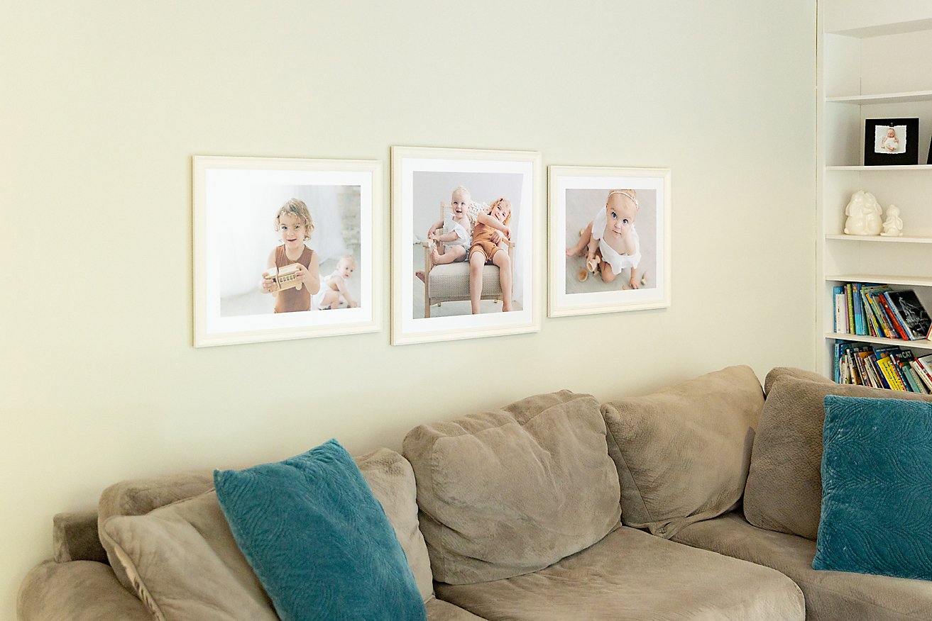
Having worked with the Young family before, we were able to blend images from each of their children’s newborn sessions into a large collage. Parents, Meagan and Devon had recently completed a large addition to their home and had a wall that they wanted to make feel more “homey”. Their decor features lots of white with light wood tones, so we chose a sleek modern frame from my collection called, “Washed Raw”.
Something about this stunning space called for a cloud-like asymmetrical gallery. We took images from baby brother Nash’s newborn session along with a newborn image from big sister Quinn’s session, too. I love this gallery because it really tells the story of the Young family at this moment in time! The silly, the sweet and the fun!
#4 - The Curtis-Blair Family
Parents Jessica & Mitch came to the studio for their daughter’s newborn session this year. They wanted to document their growing family and enjoy the images we created by designing a wall gallery for the foyer of their home. It was important to Jess & Mitch to include family and individual portraits so their children could see their sweet faces up on the walls when the passed by the busy entryway each day. We chose a cream coloured frame from my collection called, “Coastal White". From there, Jess & Mitch chose 4 equally sized portraits to fit snugly into the space above the console table in their front hall. I love this collage as it’s modular and can be expanded over time as their family changes.
#5 - The Cerni Family
Mama Catlin wanted us to create something that she and her family could see the moment they came downstairs in the morning. I installed these pieces in their main floor family room next to their picture window — the first thing you see when you’re at the foot of the stairs.
Little Luka will grow and change over the years and see the sweet beginnings of life as a family. This gallery design is also very easy to expand upon as the Cerni family changes over the years.
#6 - The Elliott Family
Parents Elissa & Tom wanted framed portraits of their children to display in the main floor family room at their new house. I love that family portraits were a part of making their new house feel more like home. The kitchen, dining & family rooms are open concept, so we coordinated the frames with the light coloured kitchen cabinets. Mama chose this simple trio allowing us to include a mix of candid and posed of her babies.
Because the family were still settling in, Elissa wasn’t 100% sure if the furniture configuration would stay the same. To keep our options open we created a collage that could work over a couch, a credenza or even be split apart to create two arrangements if the layout changed in their family room.
#7 - The Holmes Family
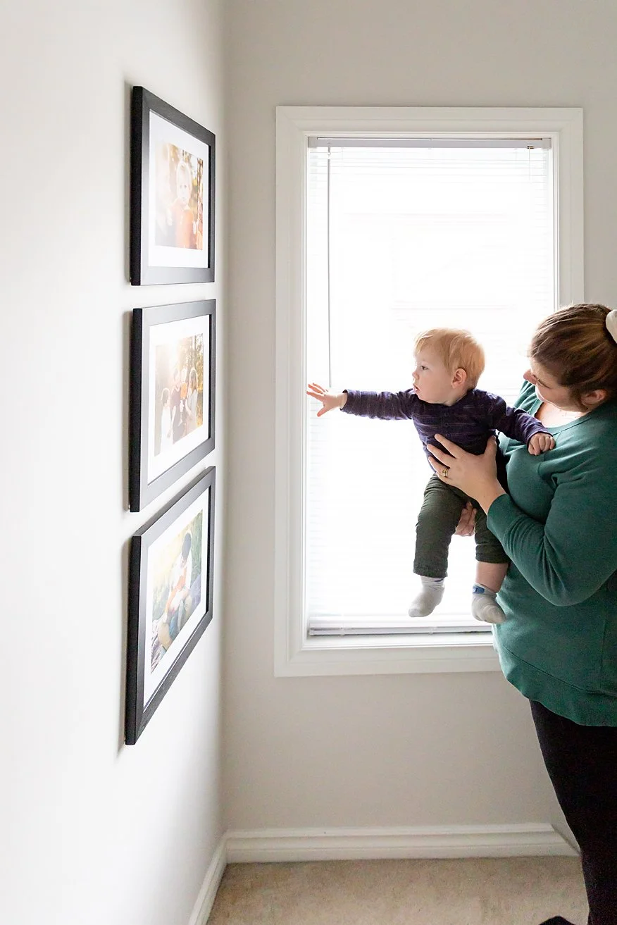
Mama Sarah was torn on where to hang her images. She wanted them in a high traffic area, but was torn between the dining room and the stairway to her 2nd floor. We used my design software to preview different options and the winner was this colourful trio for the landing of her stairs. The soft black frame anchored the bold colours in their home and balanced the golden tones in the portraits.
I love that the whole family will get to enjoy their portraits every time they take the stairs!
#7 - The McFadden-Doyle Family
This four piece collage was designed for baby Faith’s play room. This is a space where the furniture moves a lot, and things are always changing, so we created a design that could work over a couch or credenza. I love how modular this design is, too! We can add onto this design after future sessions!
#8 - The Gale Family
I love how these four pieces fit perfectly in this little nook in the dining room. Jen booked a session back in August to get some portraits of her with her two daughters and partner. We made sure to get individual portraits of her girls, as well as a family image + one very special image of her and her fiance, Warren (& the family pup, Gucci). I love how we were able to bring it all together into one portrait wall for everyone to enjoy each day.
#9 - The Butler Family
This is one of my favourite designs because we took a really unconventional approach to a stairway gallery. Typically we see images staggered up each stair. In this case the Butler family’s living space is primarily on the second floor of their century home, so they wanted to be able to enjoy the images from the landing. To achieve this we designed this trio to be visible just a few inches above the 2nd floor railing! We centred the gallery between the wall and the window and made sure it sat at eye level. I couldn’t be more in love with how it turned out, and now the Butlers can enjoy their portraits more frequently, and from a design perspective the 2nd floor appears more spacious because we are pushing the eye-line over to the stairway.
#10 - The Moulton Family
This sweet little trio made me so happy for two reasons. #1 - Mama Jasmine wasn’t sure if she wanted to print any images, however after she saw her memories she had a change of heart. We designed this trio so she could remember her daughter at this age. #2 - I love that what we created can grow with this family. We have left lots of room for more framed memories to be added to this gallery.
Here’s one example of how we can add onto this collage over time using a modular design:
There are so many possibilities and opportunities to enjoy our memories, rather than leaving them on our devices. Printed memories are the best way to make the Little moments last forever.
#11 - The Shantz Family
This lovely little trio hangs in the Shantz family dining room. This is another great example of a gallery wall that can grow with your family. We can add on additional square images or even a panoramic above the trio. My favourite part of this gallery is the mix of candid images with a really authentic family portraits - you can just feel the love and that magic childhood feeling in these!
#12 - The Cruz Family
When me and Mama Jela sat down to design this gallery, she had no idea what she wanted for her space. Her family had just renovated their rec room and Jela wanted to infuse some colour along the main wall of their TV room. Jela was also considering adding a sideboard or low shelving for storage, so we designed something that would work seamlessly with those options should she decide to add that in down the road. My favourite part of this design is that we included an image of just Mom & Dad. I think it’s wonderful that their girls will see the love between their parents whenever they see this gallery.
This gallery can also be added onto in a variety of ways. Here’s just one example of how future sessions can be incorporated into this gallery seamlessly:
#13 - The Scotts
This session was truly an honour! The sweet couple you see here are Jan & Hugh Scott. I’ve photographed their grandson many times, and they decided to book in for an extended family session as a way to celebrate their 50th wedding anniversary. I was so lucky to get to visit with them during the wardrobe consultation, the session and when the returned to choose their frame for this statement piece that we installed in the family room of their open concept home.
My favourite part of this session was hearing Jan & Hugh’s stories. They finished each other’s sentences and made me laugh so many times. I feel very honoured to have created something that symbolizes what’s important to them and that they’ll get to enjoy each and every day.
If you’ve been thinking of creating a memory wall for your home, I’d love to help. It all starts with a conversation where we’ll chat about the vision you have for your session and how I can help. Fill out the contact form, below - can’t wait to meet you!


